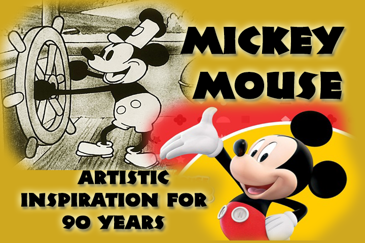
Mickey Mouse turns 90 years old today. Though he has been an icon since that first cartoon, Steamboat Willie, he’s had some changes to his appearance. Yet, he remains an artistic inspiration for many. I just started grad school for art history this year, and it started with Mickey Mouse. I have been an artist since I was able to pick up a crayon. My first drawing? Mickey Mouse! I grew up watching the Mickey Mouse shorts. I was fascinated with the animation and style. I love examining the Mickey through the decades diagrams that show off the many styles of Mickey. So, here is an art history buffs look at Mickey through the years…
 Black and White
Steamboat Willie was the first cartoon featuring Mickey Mouse and the first to wow audiences with synchronized sound. But, that’s not what fascinated audiences with this fun character. Besides the lively animation he brought at this time, there was a simple form that appeals to people even now (I’ll get to that later). Both Mickey and Minnie are comprised of simple shapes and lines. He’s easily reproduced. But, it means he’s easily remembered. We can picture simple circles for ears, and those same repeated shapes for hands, buttons, and even his waist. Then, his arms and legs are thick lines that are flexible depending on the pose. We remember the simple, and this may be why Mickey was such an easily recognizable character starting with his first appearance.
 Wonderful World of Color
Mickey stayed relatively the same from 1928 to 1935. It was at this time that the Walt Disney Studio started experimenting in color. Mickey Mouse was the mascot of the company and the star of the show. If he’s to be in color, what would be the colors associated with Mickey? It was probably a big decision in the studio. His first color appearance is in The Band Concert, and there are some key colors that have stayed with him from 1935 to today: red and yellow. Though I don’t know the exact reasons why these colors I will say that red is a color that grabs your attention. It’s active. It sticks in your mind at first glance. Yellow is playful. It can represent happiness, optimism. It’s like the sun. Both of these embody Mickey’s character so well. Then there’s the black and white for the rest of him. It’s basic color taken from his early days to make him still stick in our minds. And it goes well with the red and yellow, of course.
 Magic Mickey
One of the most recognizable appearances and poses of Mickey Mouse is Sorcerer’s Apprentice. It was his big revival after having not much cartoon shorts up to this 1940 appearance. There had to be something dynamic. Fred Moore animated him with a flesh colored face and took away the “pie eyes” of solid black circles. Now Mickey had pupils. This is the Mickey Mouse we know of well today. With Mickey being an everyman, having a more human appearance may help with this appeal. Much of the rest of his body remained the same from what was developed even early on, but some slight differences in the face make him that much more realistic. Yet, he retains the simplicity from the start that keeps sticking in our minds.
 Modernity
Mickey Mouse has kept the same appearance for the most part up until a few years ago. There are two television series that have brought Mickey to a modern look: Mickey Mouse Clubhouse and the new Mickey Mouse Shorts. Mickey Mouse Clubhouse brings about a digital art look for Mickey. The Sorcerer’s Apprentice look is now translated to three dimensions. And there’s a fundamental characteristic that is always kept for Mickey: no matter which way his head turns you will always see both his ears. Again, it allows for simple circle shapes to be instilled in our minds and burns in the icon of the Disney company.
With the Mickey Mouse shorts, we almost go back to the original Steamboat Willie days. Stripped of the pupil eyes and flesh tone of the face, he is now in simple style again. But, the shapes are a little more complex throughout than just circles and thick lines. It is that definite modern interpretation of the 1928 Mickey Mouse. We already have the original known so well we can go to a new, graphical interpretation of the character we all love. When we have a society that uses small icons to navigate through digital devices, we need that simple but fresh view of Mickey to help navigate new times.
 The Next?
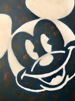
Will there be another interpretation of Mickey that we’ll see in a decade or so? I don’t know. Only time will tell. But, there are some very fundamental key elements that have been present throughout the years. And the recent shorts show that the original frame of Mickey is a style that is timeless. His timeless quality has inspired audiences and artists from 1928 to today. And, I leave you with a recent inspiration he left me recently in the photo down below. I still draw and paint Mickey from time to time, and I’m sure there are many artists that can say the same. So, happy birthday, Mickey (and Minnie) and here’s to another 90 years of artistic inspiration!


