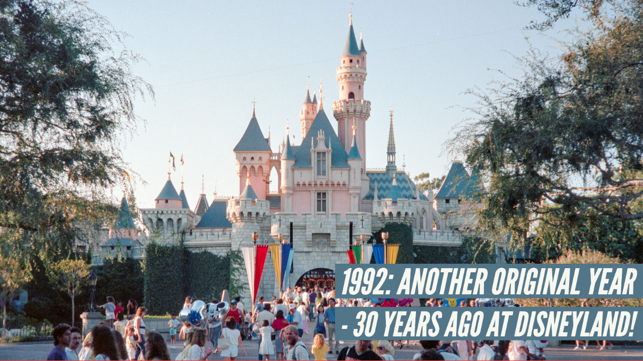
You remember a year ago that in this blog I kind of complained about the 1991 promotional “theme” for Disneyland? That after the incredible 35th anniversary year of 1990, with the alluring (and admittedly kind of baffling) Party Gras theme, the best they could come up with was “The Original?” Really. That was the theme for 1991: “The Original.” I was confident that having had a whole year to consider something fresh and exciting, that 1992 would have an all-new theme that would excite people and get them into the park for this, the second year of “The Disney Decade.”
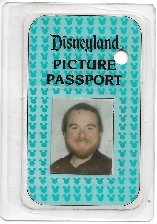
I was excited, regardless of the theme, because this was the year I bought my first, true, Annual Pass. In these simpler days there were simply two levels of Passes, Seasonal and Annual. Seasonal had some blackout dates, and parking was not included. It cost a fairly reasonable $100. The Annual Pass was good for every day of the year, and best of all, parking was included for free. And the pass was blue, instead of pink!
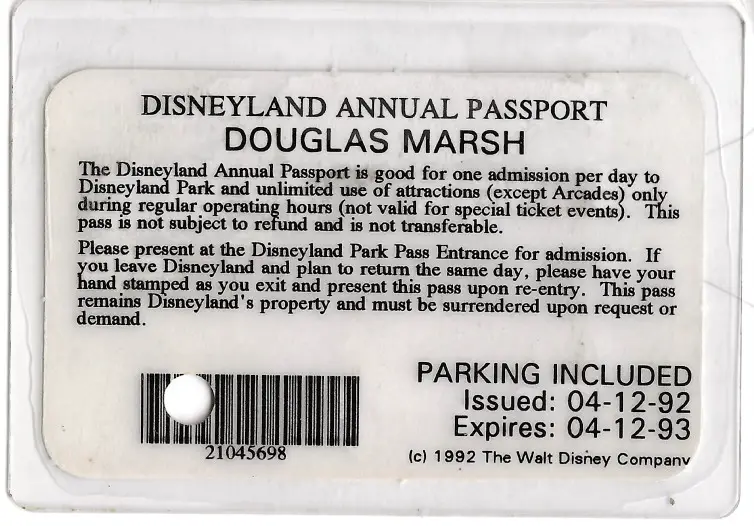
Granted, having that magical pass bearing the constant temptation to “drop in” at Disneyland at a moment’s notice at any time it was open was a bit of an initial investment. Specifically, it was $185, nearly twice the cost of the Seasonal Pass. But parking, you see, was an expensive proposition in itself: $6 per visit.
When making this kind of decision, you sometimes have to do the math. That additional $85 would cover parking for 14 visits, plus a little more. Since I was visiting Disneyland at least twice a month (often more), it seemed a wise investment. And besides, in 1992 I secured a full-time position as a designer with a guaranteed weekly income. A salary! What could be sweeter!
Disneyland, I am ready for a year of your 1992 theme!
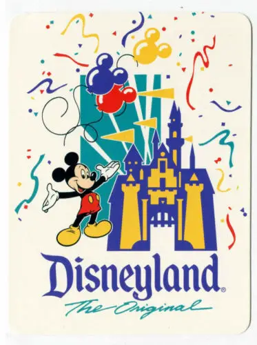
Yes, they really used “The Original” for a second year in a row. But wait! What makes it original is that it is a whole new logo! Whoever was charged to express “The Original” this year apparently decided to try the “something for everybody” design aesthetic. There’s a castle. A… stylized… castle. There’s Mickey balloons and confetti (apparently still left over from that Party Gras parade finale). There is Mickey himself. You have to have Mickey, although this year he’s given up his spiffy tux with tails, white tie and spats in favor of red shorts and yellow shoes. And then there’s a big turquoise box-thing with white lines cutting through it to represent, maybe, searchlights? And, of course, there’s the traditional Disneyland Gothic logo and the words “The Original” in the exact same script as last year.
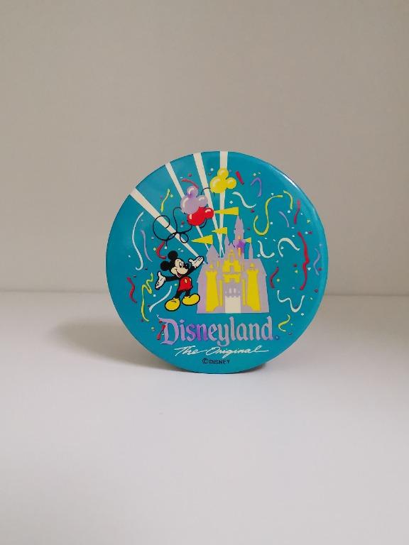
Of course, they plastered it on everything. There was a button…
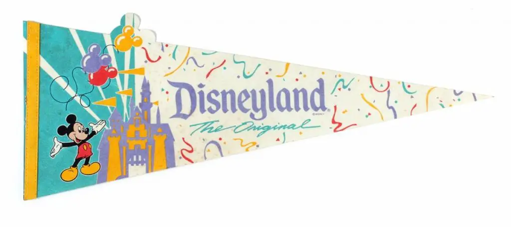
…a felt pennant (when did they stop making those?)…
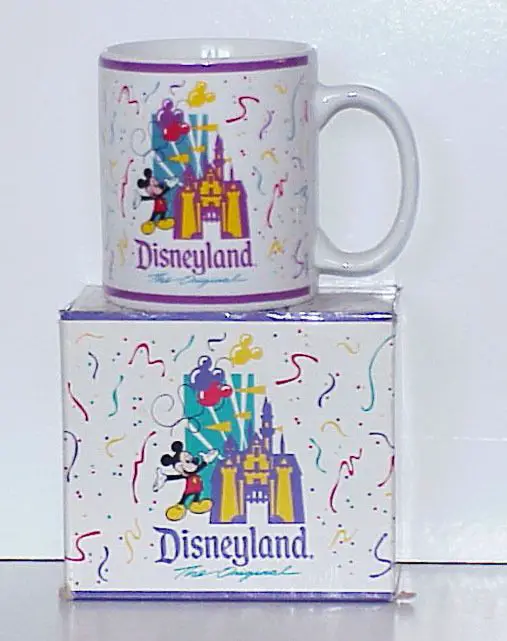
… and a mug. Years ago I belonged to a club that had a gift exchange every year for Christmas. One standing rule for the exchange: No mugs, no plush.
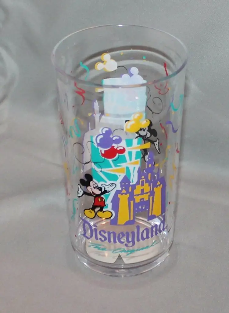
A drinking cup in plastic was an interesting addition to this year’s souvenirs. I like that they put the logo on both sides. Only wish I had liked the logo!


Something else new for this year were metallic stickers. The second one (the long narrow one) is a bumper sticker. The other is… a sticker.


And, of course, key chains. The enamel-on-metal version must have surely cost more than the $2 price tag on the acrylic version.
As for that Annual Pass and the nice new job, it turned out they were kind of mutually exclusive. You see, I did not realize when I signed on that there would be a certain amount of travel involved with the work. In fact, rather a lot of travel. And while it was exciting to see the country, I did some figuring up by the end of the year and actually declined to buy an Annual Pass for the next two years. (In all of 1994 I spent exactly 11 days in California, where I was still paying rent on an apartment!)
But in January of 1992 I had no idea this was ahead. All I knew is that I was set to enjoy a year of unlimited visits to Disneyland: The Original!

