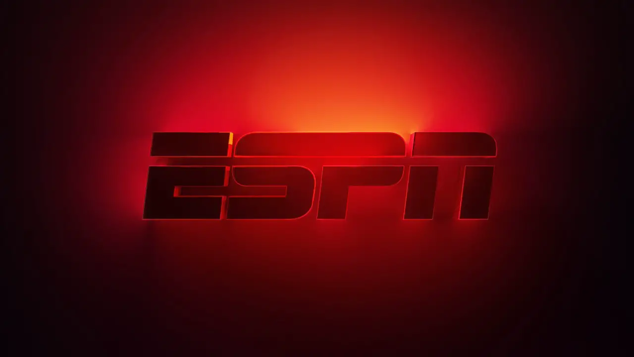
ESPN has unveiled a new opening animation sequence. This new animated sequence will be what fans experience when they enter the ESPN app through a connected television. This is a new animated sequence that also is connected to the classic one. There will be some familiarity but also some freshness. Check out the new sequence here:
“We wanted to convey that ESPN is more than a network but a vibrant connection to the emotion of sports and a hub of high-quality sports entertainment,” Donny Guy, VP of Product Design for Sports and ESPN, said.
He continued by saying that there are many different ways to connect with ESPN beyond TV. The goal with this new animated logo was to create a new introduction that “reflects the dynamic and innovative spirit of ESPN.” The other goal was to create “an animation that feels both distinctively ESPN and part of the larger Disney family,” Guy said. So, when diving into the creative process, the team used inspiration from other Walt Disney Company digital platforms like Disney+, Marvel, Star Wars, and Hulu.
Guy joined a collaboration that was already underway for this project at ESPN’s Creative Studio. This included Heather Donahue is Sr. Creative Director on design, and Claude Mitchell is the Coordinating Director of Music. The goal was to show viewers that they were about to experience a preeminent sports brand. “We wanted the ESPN brand to show up as a premium experience,” Donahue said.
The new opener includes core brand colors of ESPN that subtly reflect the reach and depth of the ESPN brand. “The movement of the light behind the ESPN logo represents all the triumphant moments in sports arenas and stadiums,” Donahue explained.
To get to the final product, there were over 40 different iterations of the animation. This took plenty of work, refinement, and tweaking to create a logo that was perfect for all platforms.
The sounds were also an important component for this new opener. First, sounds that had no relation to the SportsCenter theme or used other sections of the theme were tried. This did not work and eventually it was decided to return “to the classic mnemonic ID,” Mitchell explained. “It is so synonymous with ESPN, we had to find a way to bring it forward in the streaming world.”
“The ‘Ping’ makes the viewer look up and the ‘DaDaDa’ ushers them in for a premium ESPN Experience,” Mitchell explained.
The final product is a new signature for ESPN that was designed with versatility in mind. It will look good on mobile, web, and even on television. “The goal is to create a consistent and recognizable brand experience,” Guy said, “regardless of where our audience engages with ESPN content.”
This new opener also fits with other section titled on Disney+, like Marvel, Star Wars, and Hulu. As ESPN continues to evolve as a brand as it aims to become the premiere direct-to-consumer sports platform. “I see the animation as the beginning of how we are redefining the ESPN brand to elevate it consistently across our platforms,” Donahue said.
What do you think of this new opener for ESPN? Share your thoughts and opinions in the comments below!

